
Prismatic
A brand new paradigm for players to engage with their classes. A fulfillment of a power fantasy and a show of mastery.
Overview
With Destiny 2: The Final Shape, we wanted to add a new way for players to engage with their subclasses called “Prismatic.” It can be thought of as not a subclass of its own, but rather the pinnacle of the player’s capabilities. Hence why it is merely called Prismatic Hunter/Warlock/Titan.
I took ownership of the the majority of the UI that supported the Prismatic feature, driving conversations and ultimately building the shipping product in the following areas:
Subclass Selector
Subclass Screen
Discovery Moment
HUD Elements
Loadout Support

Subclass Selector
The subclass selector is how players choose between their subclasses. With the arrival of Strand in Destiny 2: Lightfall, we consolidated all subclasses to a single flyout. This undid the change that was done in Destiny 2: Beyond Light that separated Stasis out into its own button to the right of the Light subclasses.
My task was to “revert this,” so to speak, and assist visual design in carving out a space that made Prismatic selector stand out. During this work, I was able to collaborate with our UI Tools Engineering team to create a brand new shader, one that can dynamically adjust the corner roundness of squares and rectangles. This shader was required to get the feeling across, as we wanted to represent “Light” with the round, pill-shaped form and “Dark” with the sharp, quadrilateral form.
In addition to this, we had a request to display the damage types that the player had selected in a visually appealing way. With this, I collaborated with visual design to create auras that gently change in color depending on the types equipped. For instance, if you had Solar and Stasis, the auras would shift between orange and navy blue.
The primary button itself is also unique from other subclass buttons, in that we reutilize the portal VFX seen on the Director. This is the first instance of us having an animated background for our subclass icons.
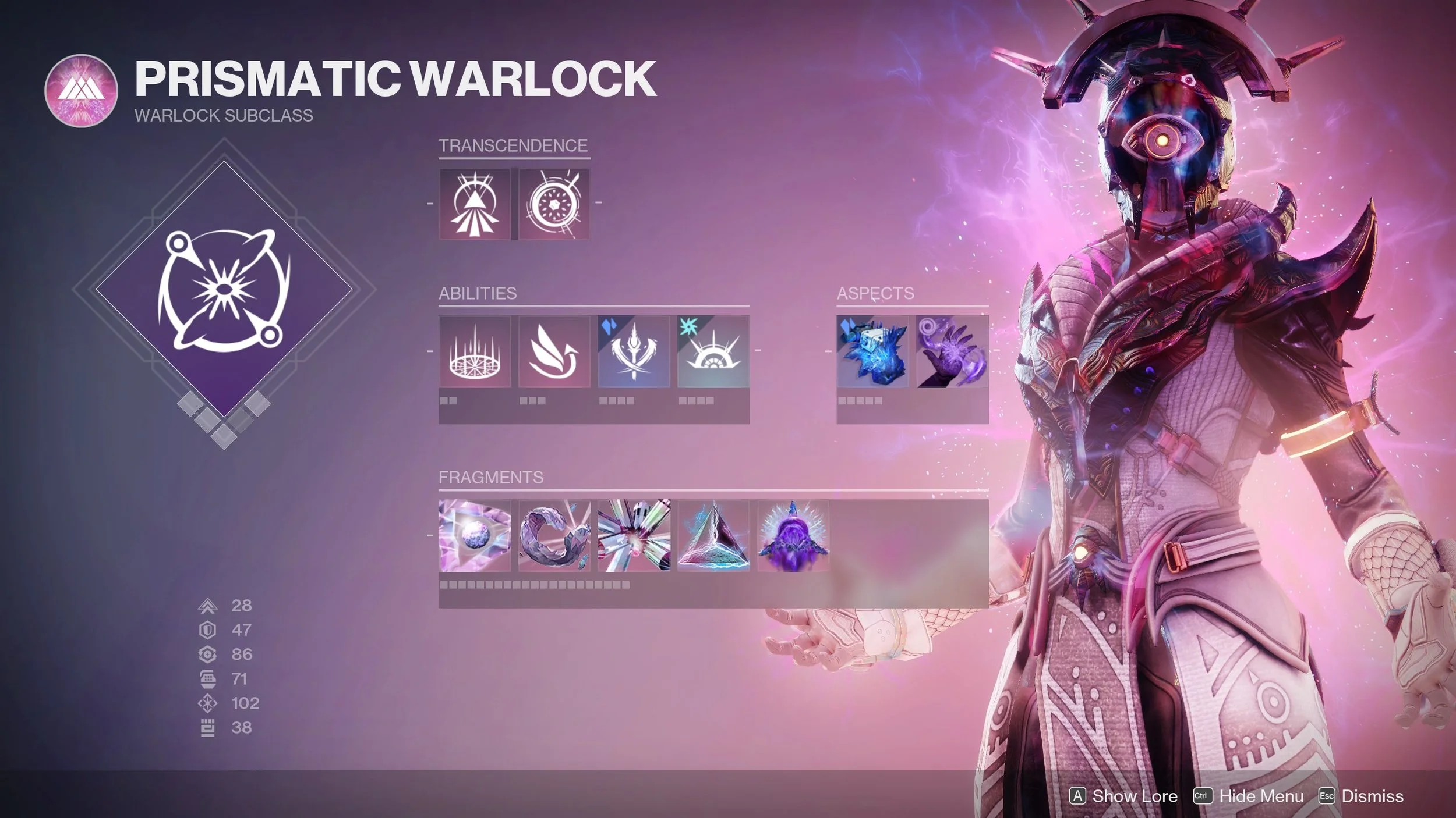
Subclass Screen
With the subclass screen, we wanted to utilize a similar layout to our existing subclass screens but provide a new fantasy with the cinematic pose, background elements, and a new row for additional capabilities. I worked with UX designers, visual designers, and cinematics to add these additional elements
We went through multiple iterations of the background before ultimately landing on a blue-to-magenta gradient that accented similarly colored VFX on the player character. This color stays consistent across our Prismatic branding.
We also had a few different iterations on how to show the damage type of any given subclass “atom” (such their super, grenade, class ability, and aspects) before we landed on having the magenta pink be the default and overridden with the damage type’s colors. An additional watermark is placed in the top left with the damage type’s icon as well.
Discovery Moment
One of the most novel parts of building the Prismatic experience was that was this FTUE for when the player first encounters Prismatic power.
I utilized our dialog technology and worked with sandbox designers to ensure that it fired when the player acquires Prismatic for the first time, when I launch them into a pared down version of the character screen that I build specifically to show where the selector is located and how to unlock more pieces of Prismatic.
I utilized a familiar pattern, our NUXes that appear at the bottom of the screen with the ghost icon, to show a 3 step tutorial for the player to unlock their remaining pieces of the Prismatic subclass.
HUD Elements
With Prismatic, we brought a new gameplay mechanic to the player known as Transcendence. This is a state that grants the player additional powers and a unique grenade, gained by damaging enemies with both Light and Dark.
In order to do so, we had to add an indicator on the screen that showed this progression and its states:

Charging
Fully Charged (One Side)
Fully Charged (Both Sides)
Unavailable (If you are not in a state where Transcendence is possible)
We played around with different locations for the display, but each had its own drawbacks:
Under the player’s abilities, it was a very tight space to fit two bars, not to mention that the space gets even smaller if the player has multiple charges for any of their abilities. This ruled out the location.
Under/around the super icon, it was a little too far to the edge of the screen, and it was difficult to see incremental increases as the player interacts with the game world.
Ultimately, we landed on having the two bars be sandwiched above the weapon and ability tray, but below the super bar. This made a lot of sense, since we oftentimes felt that Transcendence was like a “miniature super ability” given that you must charge it up and it provides an elevated state for the player.
This work was previously done by one of the other tech designers, but I took the work as they were moving to another team. After I took got caught up with the technical specifications, my next step was ensuring that the animation work was similar to the rest of Destiny’s UI style
Loadout Support

Because this was a new subclass, as well as support auto rifles coming out at the same time, we wanted to add new colors, icons, and names to our loadout system for players to use.